True / False
This exercise can be used in most cases. This will allow us to visualize the level of knowledge acquired within our training.
It consists in selecting one answer which is correct.
The first step is to add a text box containing the question:
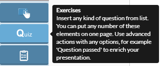
Select the Quiz tab on the left side of the screen, then select multiple choice.
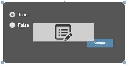
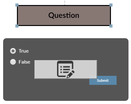
On the scene we see an additional window containing 2 responses, checkboxes that we can select the "confirm" button
and a menu button in the form of a gray button with a list icon.
We are going to edit the content of our quiz:
We see the following:
- The checkbox placed to the left of the text field with a question specifies
- the correct answer.
- text boxes for answering questions
- "Red X" - a button to clear unnecessary answers
- "Black +" - allows you to freely move text fields within the quiz window
- + add a new answer - we add another reply.
- The "confirm" button allows us to complete the test.
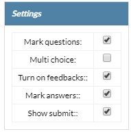
However, these are not all settings we have - the majority of exercise settings are in the "Properties" tab and look like this:
We see a number of settings responsible for:
Settings:
- After unchecking the "Mark questions" option, we will not see the test / disapproval icon at the top of the answer panel.
- multi choice - by default, deselecting it will change the quiz to multiple choice.
- Turn on feedbacks - Disables the informative text box
- about the correct answer
- Mark anwsers - means the answer
- Show submit - allows you to hide the "confirm" button so we can use our own button located anywhere in the scene.
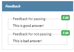
Feedback :
- After the correct answer, we define the content of the displayed message
- After the incorrect response, we specify the contents of the displayed message
Properties
- Font size determines the font size
After the full configuration of the exercise properties we add the answer, select the correct answer, we can also change the location of the response.
As you can see we changed the color of the text box with a question, it looks much more interesting, after selecting the text box we enter the properties
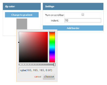
and change background color
Once we find the color that matches our concept, we confirm it with the "Choose" button.
If the color of the query text field and the response screen significantly. We can differentiate from one another by using the "ready-made" tab in the bottom panel.
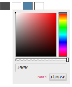
We choose the theme we like, and the colors of our field change accordingly with what we chose. It is worth noting the four windows to the right
of the finished styles. With these windows we can freely change the color of individual elements of our window
- The first window is responsible for the background color
- second color font
- the third determines the color of the "confirm" button
- fourth font color of the "confirm" button font
In case the proposed color schemes do not suit us, we can create your own composition using them.
Using this tool we will make minor modifications - we will use the external browser plugin "colorzilla", which will determine the color
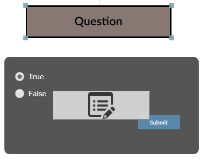
of our header and the same color we will use in the reply window. Both of our windows now look like this:
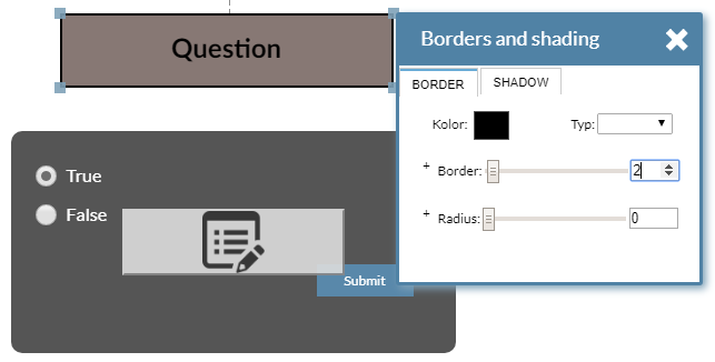
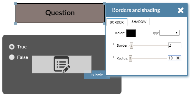
As you can see both color panels are close to each other, there is no frame in the test field - we mark them and left click, select the border
Then select the frame type, its color or rounded corners - radius
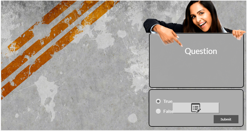
Coloring has been standardized, the contents of the windows are fully legible. However, it seems that the scene looks "empty" - we will use ready-made
styles and add the background that will fill our scene. We will also use the image library. And we will search for a matching character, so we will revive
our presentation:
As you can see the coloring of the scene matches to look much more interesting,
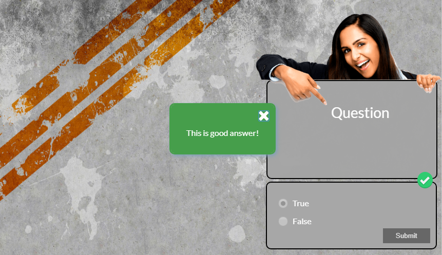
The last step in our work is to check that the exercise is working properly. In the case of standard settings, after giving the correct answers, we will see:
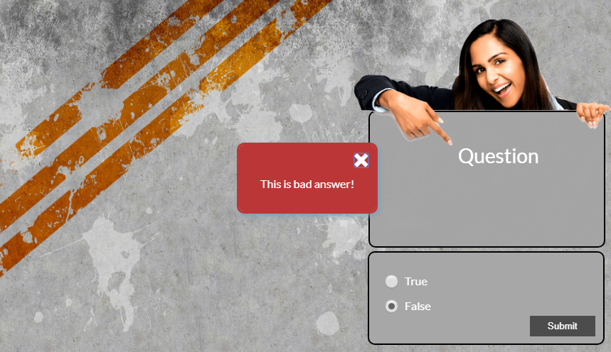
Wrong answers will be presented as follows:

