Survey elements
This is a tool, that will enrich our presentation with a number of elements related to surveys. This will allow us to create a multimedia presentation
that is attractive to the user, but also to present the level of knowledge gained through the presentation.
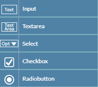
If you click on the survey button, you will see a menu from which you can select specific types of questionnaires.
Input
When you select this item, a text box will appear on the stage where the user should enter the correct phrase.
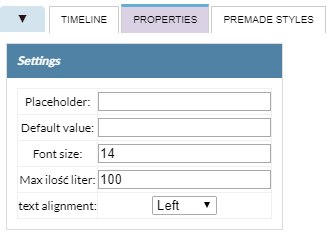
The content of the survey field is determined by going to the properties tab / settings /
initial value - after entering the correct phrase the exercise will be fully configured.
We have the ability to specify a number of text field parameters these are:
Placecholder -
Default value -
Font size - is responsible for the size of the characters.
Maximum number of characters - is responsible for the number of characters that
can be entered in the window.
Text alignment - we have 3 available left and right page options, aligned to center.
Textarea
When you select this item, a text box will appear on the stage where the user should enter the correct phrase. Unlike the previous survey,
the field will be much larger.
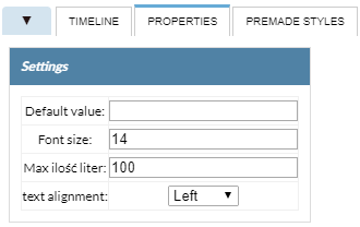
The content of the survey field is determined by going to the properties tab / settings /
initial value - after entering the correct phrase the exercise will be fully configured.
We have the ability to specify a number of text field parameters these are:
Placecholder -
Default value -
Font size - is responsible for the size of the characters.
Maximum number of characters - is responsible for the number of characters that
can be entered in the window.
Text alignment - we have 3 available left and right page options, aligned to center.
Select
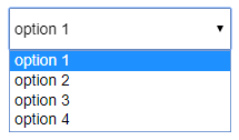
It is a form of questionnaire in which we define any number of proposed variants of answers, the user of the exercise chooses one of the answers on the list.
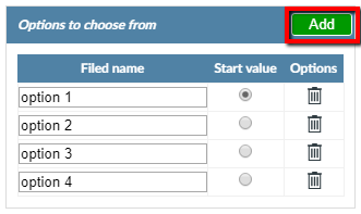
We configure the exercise using the Properties tab. We have a number of options to help you:
The Add functionality allows us to add further responses.
Field name - specifies the phrase in a specific window.
Start value - determines whether the answer is correct.
Options (trash icon) - removes unnecessary answers.
Checkbox
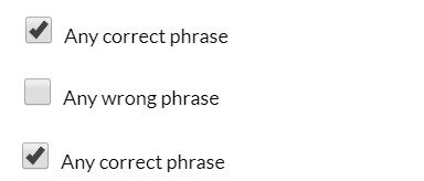
This exercise is used when we want to place more on the stage than one correct answer. On stage we put the right amount
of questionnaire is necessary.
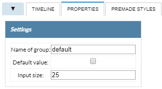
We configure the exercise in the Settings / Settings tab:
Name of group -
Default value - specifies the correct answer.
Input size - The number of characters that can be placed in a text window.
Radiobutton
We use this type of exercise when we want to place one correct answer on the stage. After placing a poll on the stage,
we can add a number of others elements.
We configure the exercise in the Settings / Settings tab:
Name of group -
Default value - specifies the correct answer.
Input size - The number of characters that can be placed in a text window.
